The Joy in a Broken Heart
A million years ago, I was living and working in Switzerland at a startup called Singularis. One of the first things I worked on was a set of icons for our rating system. We decided to use thumbs up and thumbs down with some thumbs tilted at various angles for ratings in between. I drew them all in Adobe Illustrator and animated them in Macromedia Fireworks.
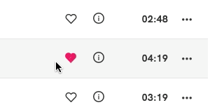
I was reminded of this today when I noticed the animated heart icon in Qobuz (seen above) which indicates that you are going to unfavorite a song. It’s a nice little touch to the UI that is completely unnecessary. They certainly didn’t have to animate it. They didn’t even need to make it a broken heart. They could have just flipped back to the unfilled heart outline that is the default unfavorited state.
I miss this part of creativity and details in my work in the last few years. We are so focused on features and rolling out new ways to handle data and smart AI and machine learning. These touches that have personality have all but disappeared from most of the apps we use.