The Truth of Work

People think programming is cool and fun. I spent 30 minutes pondering the nature of truth while typing this inanity:


iex(15)> true and false

false

iex(16)> not (true and false)

true

iex(17)> true or false

true

iex(18)> not (true or false)

false

iex(19)> not (true or true)

false

iex(20)> not (false or false)

true

Shortcut to blog a book excerpt to Micro.blog

I still like to read a printed book. Often, I’ll come across a passage that I want to comment on or just save. In the past, I’ve used my phone to take photos of the text. That has obvious problems. Now, with iOS 15, the phone camera has a built-in OCR tool that can extract text from a photo. And it works pretty well.

Now, I’d like to make it easy to make a Micro.blog post with that text and add whatever commentary I’d like to add. Since I use M.b’s Bookshelves feature, I wanted to incorporate some information about the book in the post.

So, I created a Shortcut that makes this easier to do. You can install the shortcut here. You’ll need to provide an API token from Micro.blog when installing the Shortcut.

Here’s how it works. First, use the camera’s OCR tool: An iPhone screenshot showing text highlighted in the photo being taken using the phone camera's 'LiveText' feature.
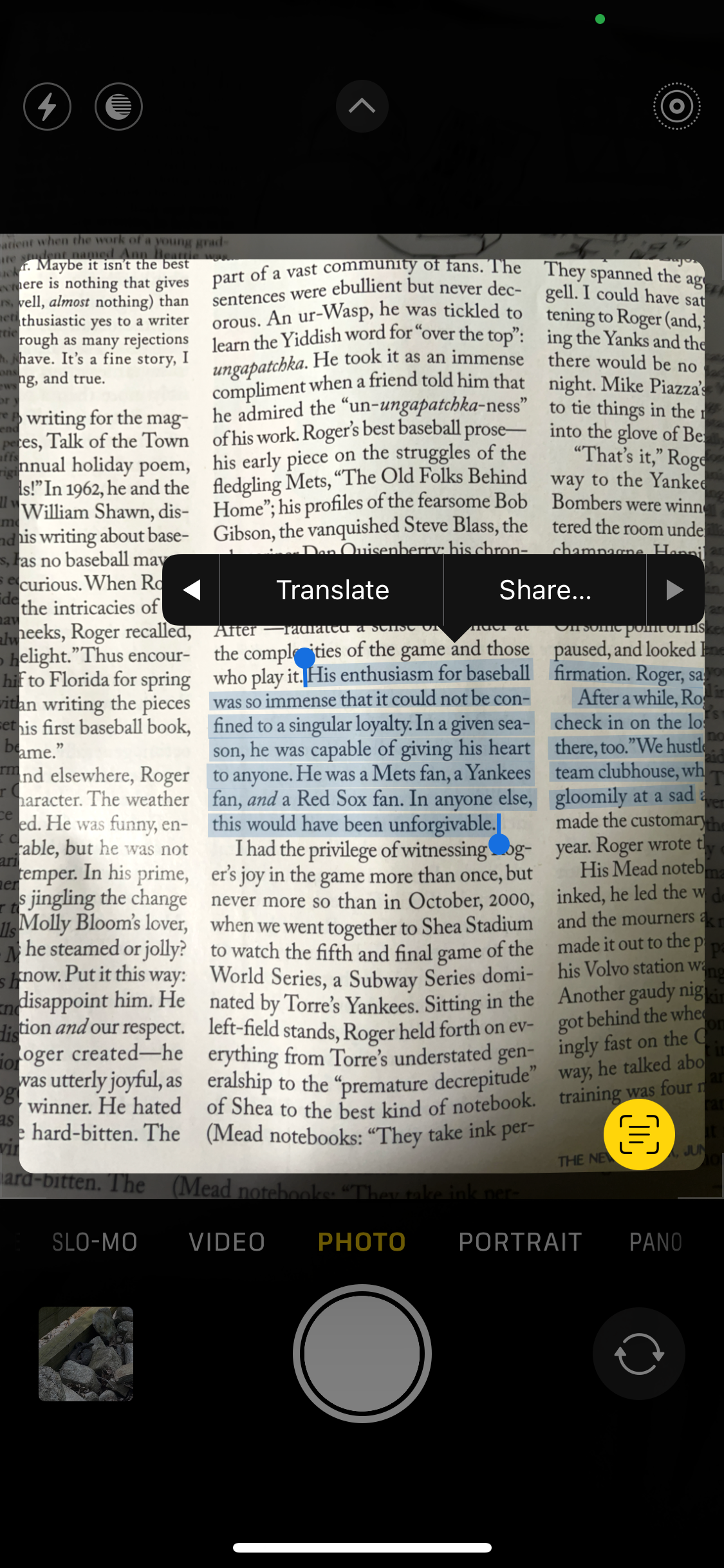
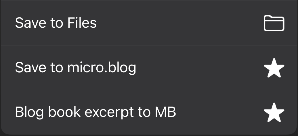
If you tap the “Share…” button, you’ll then see the iOS share sheet with the Shortcut listed as “Blog book excerpt to MB”: An iPhone screenshot showing the installed Shortcut as an option in the share sheet.
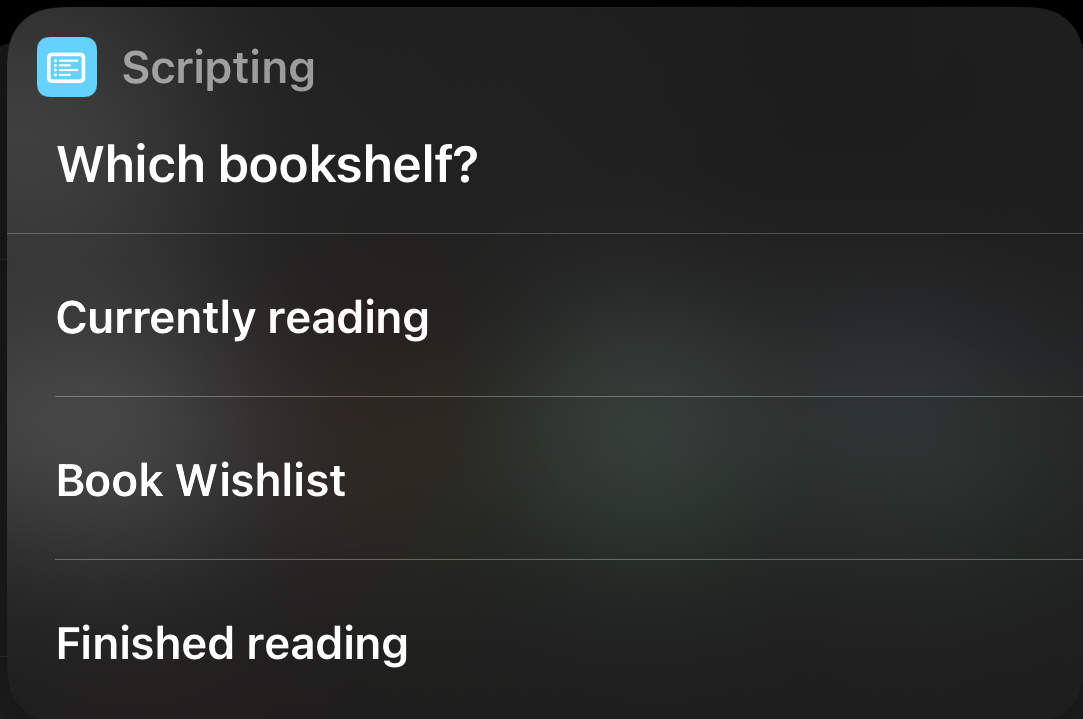
Next, the Shortcut will grab the Bookshelves you have configured in Micro.blog: An iPhone screenshot showing a list of the user's bookshelves pulled from the Micro.blog API.
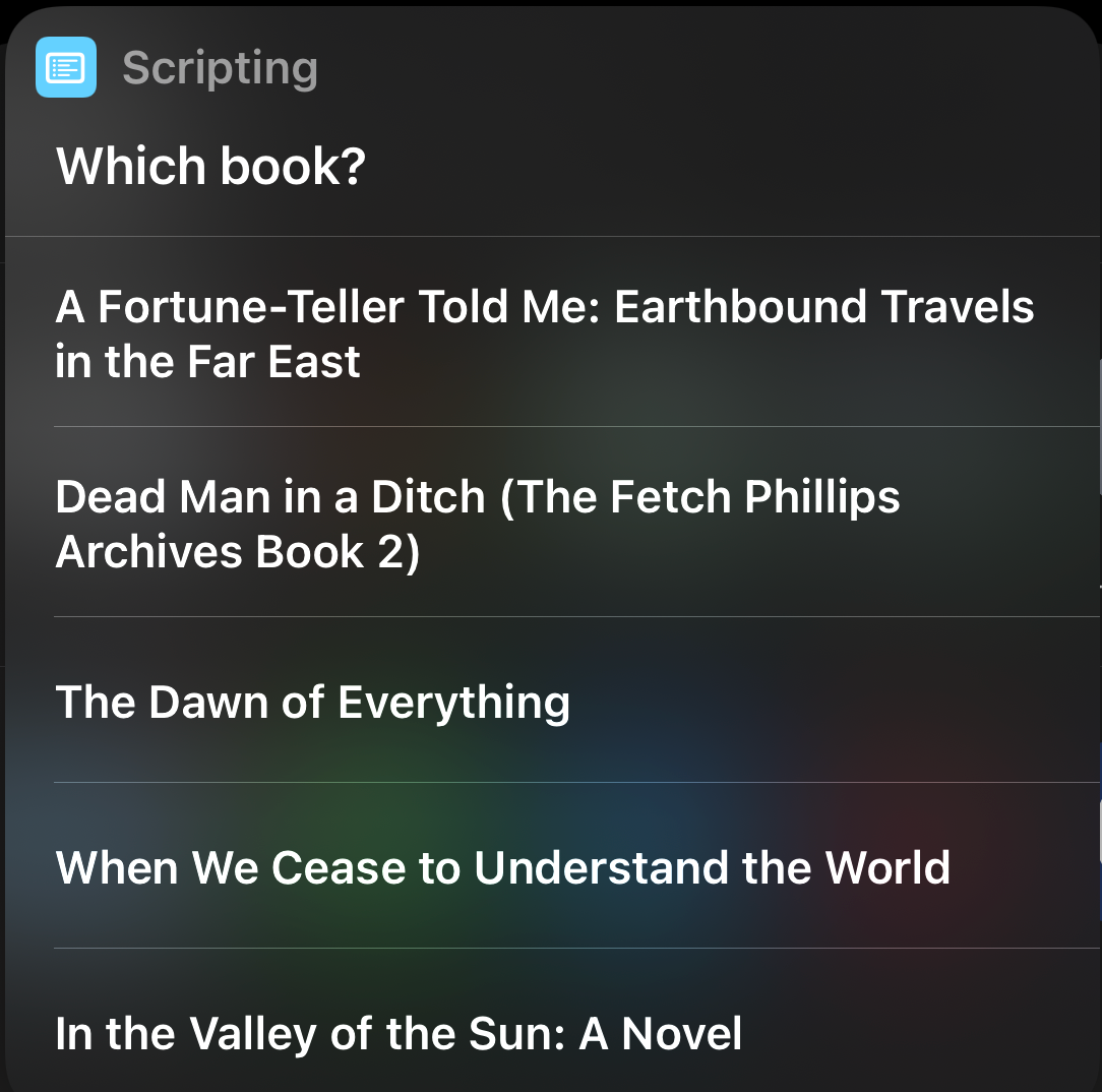
Then, you’ll see a list of the books you have stored on that shelf: An iPhone screenshot showing a list of the books kept on that user's bookshelves.
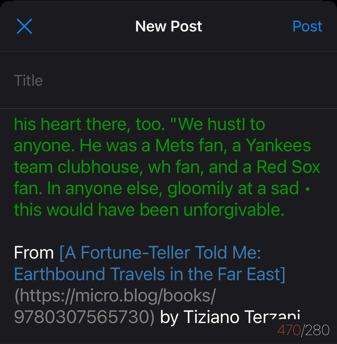
Lastly, the Shortcut will format some of the text retrieved and open the Micro.blog app which you have installed on your phone (right?). You’ll see the excerpt you selected from the photo. It will be combined with the book title and the book author with links to that book on your shelf. You can then edit the post in any way you like and post it. It looks like this: An iPhone screenshot showing the new post interface of the Micro.blog app pre-filled with the book excerpt and other details you can post.
If you don’t use M.b’s bookshelves, it should be easy to edit the shortcut to remove those steps that talk to the Micro.blog API. You might also want the Shortcut to prompt you for other details like a page number or whatever you like. One of the nice things about Shortcuts is that you can start with this one and make it into something that fits your workflow even better.

Vapor1994 in Swedish

I received a report from @ndreas that my Vapor1994 theme wasn’t working with some characters in the Swedish alphabet. My initial instinct was that the fonts I chose simply didn’t have those characters.

I made a test post on my test blog using what I think is a review of a grill which I copied from Aftonbladet. Those Swedish characters seem to be working correctly as shown in the screenshot below. I think something else must be wrong.

A screenshot showing Swedish text displaying correctly in a test post using the Vapor1994 theme.

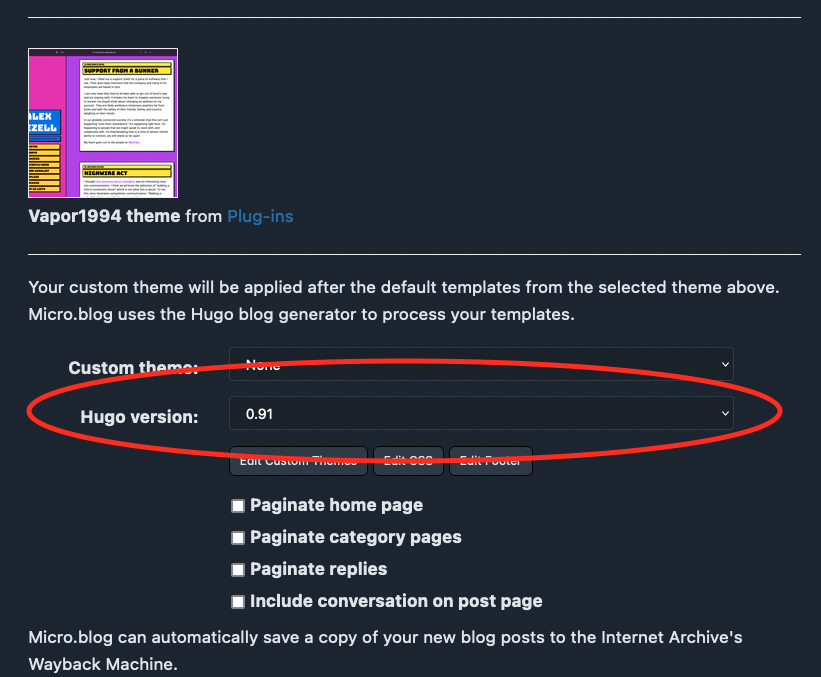
One thing any Vapor1994 user should confirm is that your blog is using Hugo version 0.91. This is set on the “Design” page as shown in the screenshot below.

A screenshot of Micro.blog's Design settings page with the Hugo version selection field highlighted with version 0.91 selected.

If anyone has any ideas what might be causing problems for @ndreas, please let us know.

The Joy in a Broken Heart

A million years ago, I was living and working in Switzerland at a startup called Singularis. One of the first things I worked on was a set of icons for our rating system. We decided to use thumbs up and thumbs down with some thumbs tilted at various angles for ratings in between. I drew them all in Adobe Illustrator and animated them in Macromedia Fireworks.

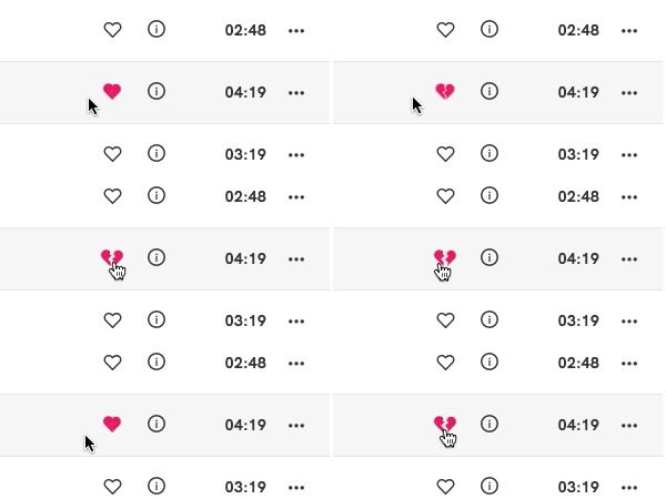
I was reminded of this today when I noticed the animated heart icon in Qobuz (seen above) which indicates that you are going to unfavorite a song. It’s a nice little touch to the UI that is completely unnecessary. They certainly didn’t have to animate it. They didn’t even need to make it a broken heart. They could have just flipped back to the unfilled heart outline that is the default unfavorited state.

I miss this part of creativity and details in my work in the last few years. We are so focused on features and rolling out new ways to handle data and smart AI and machine learning. These touches that have personality have all but disappeared from most of the apps we use.

Portals and MUI and Maps

I’m posting this in case Google finds it and it helps someone else. I’m building some mapping functionality using Leaflet, react-leaflet, and MUI components. To add custom controls to the map, I took advantage of this react-leaflet-custom-control library. It worked great. Until I tried to use a MUI Autocomplete component.

I was having an issue where the custom control wasn’t stopping click propagation. I saw that the custom control library was using L.DomEvent.disableClickPropagation(portalRoot) so I assumed it would work. In my case, it did not.

This was the original setup of my code (generalized for public consumption):

const Search = () => {
  const map = useMap()
  const goTo = (place) => {
    map.setView([place.latitude, place.longitude], 13)
  }
  return (
    <>
      <Autocomplete
        disablePortal
        id='combo-box-search'
        options={places}
        onChange={(e, value) => {
          goTo(value)
        }}
        renderInput={(params) => <TextField {...params} label='Search' />}
       />
    </>
  )
}

<MapContainer
  center={[userPosition.latitude, userPosition.longitude]}
  zoom={12}
  scrollWheelZoom={false}
>
  <Control prepend position='topright'>
    <Search />
  </Control>
  <TileLayer
    url='https://{s}.tile.openstreetmap.org/{z}/{x}/{y}.png'
    attribution='&copy; <a href="http://osm.org/copyright">OpenStreetMap</a> contributors'
   />
</MapContainer>

The key was that disablePortal prop that I was passing to Autocomplete. Since the custom control uses the portal functionality to target the correct divs and such, that disablePortal in my MUI component was breaking the functionality.

So, word to the wise, you should try understand, better than I do, when a library is telling you that the way it uses portals is potentially tricky. I still don’t fully understand all of this but I did get it working. That basically summarizes my whole engineering career.

Vapor1994 v1.1.0 Released

Vapor1994 v1.1.0 is now available.

It seems like the Vapor1994 theme hit a chord with a few folks. Even within that praise, some didn’t care for the garish colors, or what I called “neubrutalist”. They wanted to adapt the theme to their color preferences. For some users of Micro.blog, that means editing, or adding, CSS and they are comfortable with that. For other users, that’s a barrier.

I decided to make all the colors of the theme configurable via Micro.blog’s plugin settings. There you can configure a couple dozen or more colors. Every color used in the theme is there and you could make them all different. Or you could just change one or two. This still requires some CSS knowledge but the barrier feels a good bit lower for the less technical user.

The defaults provided are my preferred synthwave-inspired colors. So, if you were using the theme with no customizations, this upgrade shouldn’t change anything for you. I did not change any CSS selectors or HTML classes, so if you do have customizations, they should still effectively override these new defaulted settings.

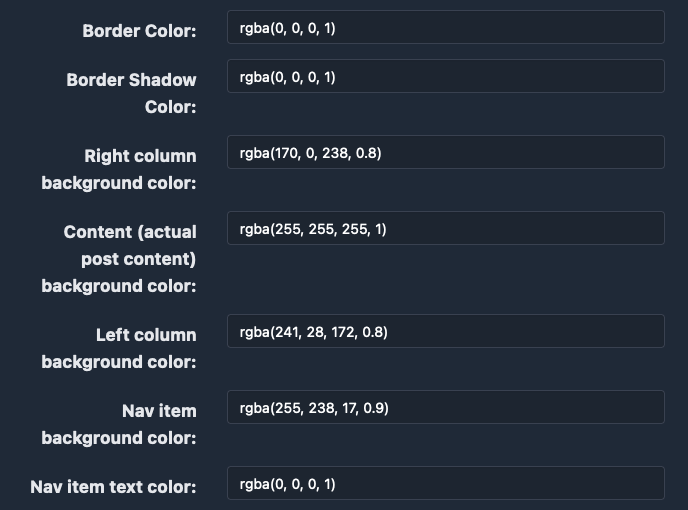
Below is a screenshot of some of the settings. There are many more.

A screenshot of the Micro.blog plugin settings for the Vapor1994 plugin. It shows a sampling of the CSS settings that a user can set which would change the colors used in a site using this plugin.

Announcing Bandcamp Shortcode Plugin for Micro.blog

I just pushed up the initial release of a plugin for Micro.blog. It’s boringly called plugin-bandcamp. It allows you to use a shortcode to embed players from the Bandcamp site.

It looks like this:

You can install it to your Micro.blog from this page.

I worked hard to make it so the user can take advantage of the various layouts and options that Bandcamp’s embeds offer. That usage looks like this in code:

{{&lt; bandcamp url="https://jakexerxesfussell.bandcamp.com/album/good-and-green-again" layout="standard-small-art" tracklist="true" theme="dark" &gt;}}

and this as the actual embed:

There are more details in the readme.

← An IndieWeb Webring πŸ•ΈπŸ’ β†’